There have been several iterations of the visual layout for the various screens found throughout Dr. Bulbaceous, our latest game.
I thought I'd immortalise it here as a blog post, more a measure of progress than anything else.

The old user interface for the level selector was pretty straightforward; it was more or less a table with rows and columns filled with basic information about the levels and how much they cost to "unlock". Pardon the manual screenshot - this was the only device I had available that still had the old version of the game.
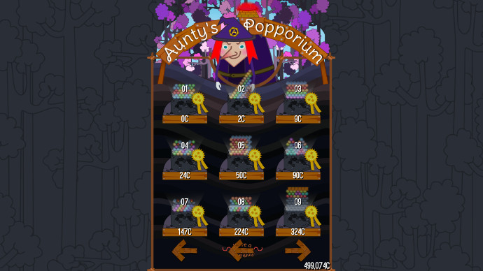
This is the new (still in-progress) user interface for the same level selector. It has considerable cosmetic alterations including a preview of the levels themselves and a progress medal to gauge how well you played that particular level, all within the confounds of each column represented as a well in its own right.
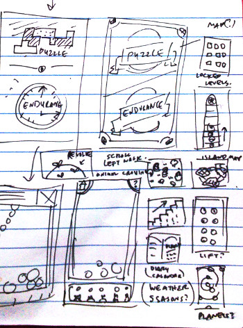
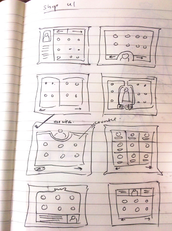
I tried various designs previously before settling with the current one. You can see from the sketches above that it included things like a map layout, planetary system, a rather tall mole hill, a diary of sorts, a revolving globe and even an elevator shaft type thing (any excuse for elevator music, really!) but all of these designs would mostly benefit from playing the game on a large screen and we were targeting mobile phones and small (narrow) handhelds.
So a table it is then, which made me decide to turn the level selector into a shop inventory or rather, a moveable feast of sorts wherein a character sells you things - in this case, levels. Naturally, this was an opportunity to include a game character we have in another game who, so happens, is a shopkeeper and thus, Aunty's Popporium (because everyone knows your favourite auntie gives you the best price) is now available for your perusal.
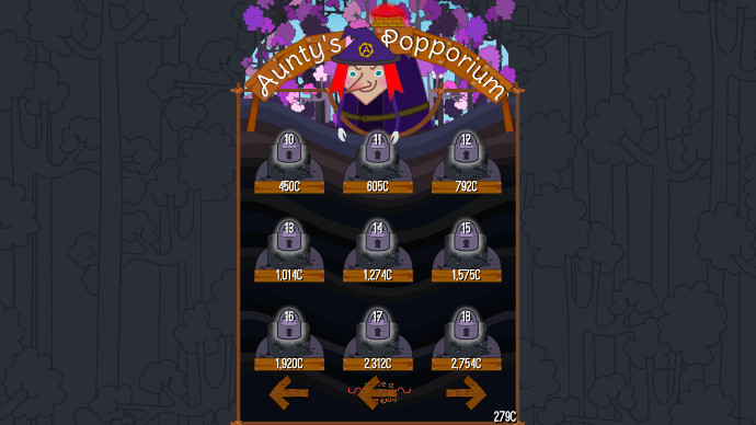
When unlocked, the preview of the levels will be replaced by a padlock instead.
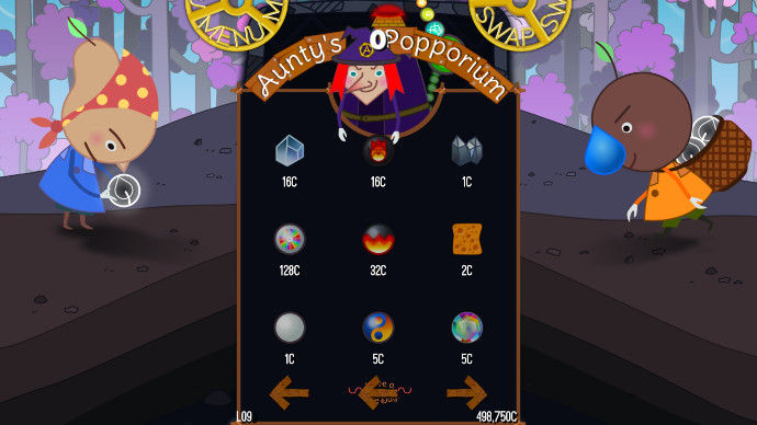
This is the user interface of the shop within the level itself. Ultimately, it will be slightly different as it pops up during play and is accessed by selecting the "SWAP" cog, at the top right of the game screen. We tried to simplify the game screen as is possible so as not to overwhelm the user with superfluous information. This meant designing the menu buttons as part of the "well" - in this case, pulley cogs that constantly rotate during the game. However, from live playtesting, it seems most people ignore the buttons entirely until much later in the exploration of the user interface when they have settled in and relax into the game.
At the bottom of the screens are two bits of information; to the left of the screen is the level you are playing in and to the right, the number of cookies you have been awarded so far. This is the currency for the game (and the currency for all our games on Wetgenes) whenever I mention purchasing items from Aunty's Popporium as there will not be any in-game purchases at all; a concept neither of us are crazy about. Cookies are awarded in various ways, a topic I will delve deeper into as a later post.
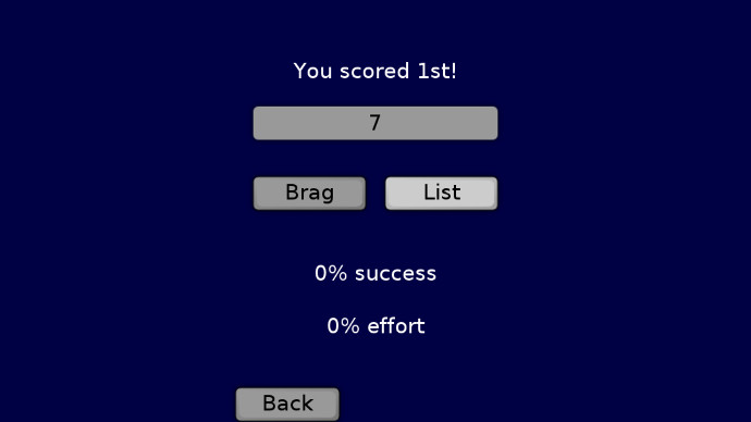
This was the old end screen. Again, it is straightforward and tells you your score, how you gauge compared to others and how much better you are compared to the last time you played. We have a system in place where multiple users are able to play the same game and retain their own scores to allow this.
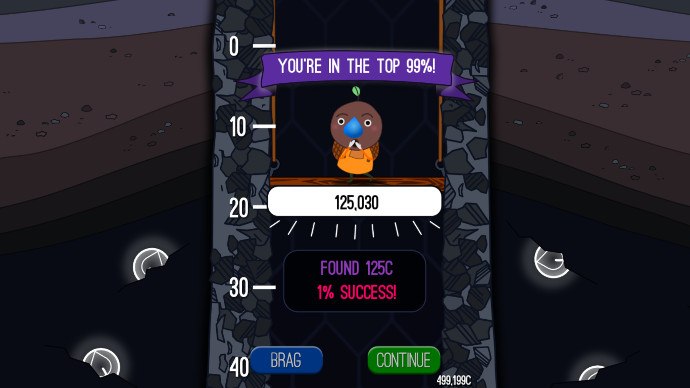
This is the current end screen albeit a static one. A simple animation of Dr. Bulbaceous descending down the well with a few musical scores and sound effects transforms the game over screen into a joyous event - at least, that is the theory. We've decided not to show the leaderboard after this screen as it disconnects the "joyous" feeling. Instead users can access the leaderboard, along with other options and settings, via the title screen.
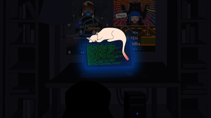
Finally, I thought about the several ways to make the loading screen more visually pleasing. Previously, it was a wall of randomly generated text scrolling by you like you were in the matrix but now, it is a scene from the "studio" herself albeit an exaggerated one; sleeping kitty included. There is an alternative loading screen for our free games as opposed to this one which is a paid game.
And thus, ends this post - if you're still reading, many thanks and see you in the next one.
I thought I'd immortalise it here as a blog post, more a measure of progress than anything else.

The old user interface for the level selector was pretty straightforward; it was more or less a table with rows and columns filled with basic information about the levels and how much they cost to "unlock". Pardon the manual screenshot - this was the only device I had available that still had the old version of the game.

This is the new (still in-progress) user interface for the same level selector. It has considerable cosmetic alterations including a preview of the levels themselves and a progress medal to gauge how well you played that particular level, all within the confounds of each column represented as a well in its own right.


I tried various designs previously before settling with the current one. You can see from the sketches above that it included things like a map layout, planetary system, a rather tall mole hill, a diary of sorts, a revolving globe and even an elevator shaft type thing (any excuse for elevator music, really!) but all of these designs would mostly benefit from playing the game on a large screen and we were targeting mobile phones and small (narrow) handhelds.
So a table it is then, which made me decide to turn the level selector into a shop inventory or rather, a moveable feast of sorts wherein a character sells you things - in this case, levels. Naturally, this was an opportunity to include a game character we have in another game who, so happens, is a shopkeeper and thus, Aunty's Popporium (because everyone knows your favourite auntie gives you the best price) is now available for your perusal.

When unlocked, the preview of the levels will be replaced by a padlock instead.

This is the user interface of the shop within the level itself. Ultimately, it will be slightly different as it pops up during play and is accessed by selecting the "SWAP" cog, at the top right of the game screen. We tried to simplify the game screen as is possible so as not to overwhelm the user with superfluous information. This meant designing the menu buttons as part of the "well" - in this case, pulley cogs that constantly rotate during the game. However, from live playtesting, it seems most people ignore the buttons entirely until much later in the exploration of the user interface when they have settled in and relax into the game.
At the bottom of the screens are two bits of information; to the left of the screen is the level you are playing in and to the right, the number of cookies you have been awarded so far. This is the currency for the game (and the currency for all our games on Wetgenes) whenever I mention purchasing items from Aunty's Popporium as there will not be any in-game purchases at all; a concept neither of us are crazy about. Cookies are awarded in various ways, a topic I will delve deeper into as a later post.

This was the old end screen. Again, it is straightforward and tells you your score, how you gauge compared to others and how much better you are compared to the last time you played. We have a system in place where multiple users are able to play the same game and retain their own scores to allow this.

This is the current end screen albeit a static one. A simple animation of Dr. Bulbaceous descending down the well with a few musical scores and sound effects transforms the game over screen into a joyous event - at least, that is the theory. We've decided not to show the leaderboard after this screen as it disconnects the "joyous" feeling. Instead users can access the leaderboard, along with other options and settings, via the title screen.

Finally, I thought about the several ways to make the loading screen more visually pleasing. Previously, it was a wall of randomly generated text scrolling by you like you were in the matrix but now, it is a scene from the "studio" herself albeit an exaggerated one; sleeping kitty included. There is an alternative loading screen for our free games as opposed to this one which is a paid game.
And thus, ends this post - if you're still reading, many thanks and see you in the next one.
Click here to login if you wish to comment.
View all posts.
View all posts.
11 years ago shi commented on Dr. Bulbaceous: Puzzle Solver...


