If, like me, you actually read stuff on the internets, then tomorrow is a day you might dread - the day when Google Reader retires into the nether region of the virtual world, never to be revived ever again.
Fortunately there are plenty of alternatives out there, albeit inferior in many ways, and I have been using one sparingly since the announcement and since then, more have turned up as possible replacements. Migration to the new services was mostly hassle-free; some asked to import your feeds whilst most were as easy as logging into your Google account and allowing the new services permissions before taking you to a page where all the feeds you've been reading appear before you in an instant.
In fact, it has been so easy to migrate that I've been trying out a few. Here are a few screenshots of the readers I've used. For the sake of comparison, I've picked a particular folder to display; the one that I read above all else.
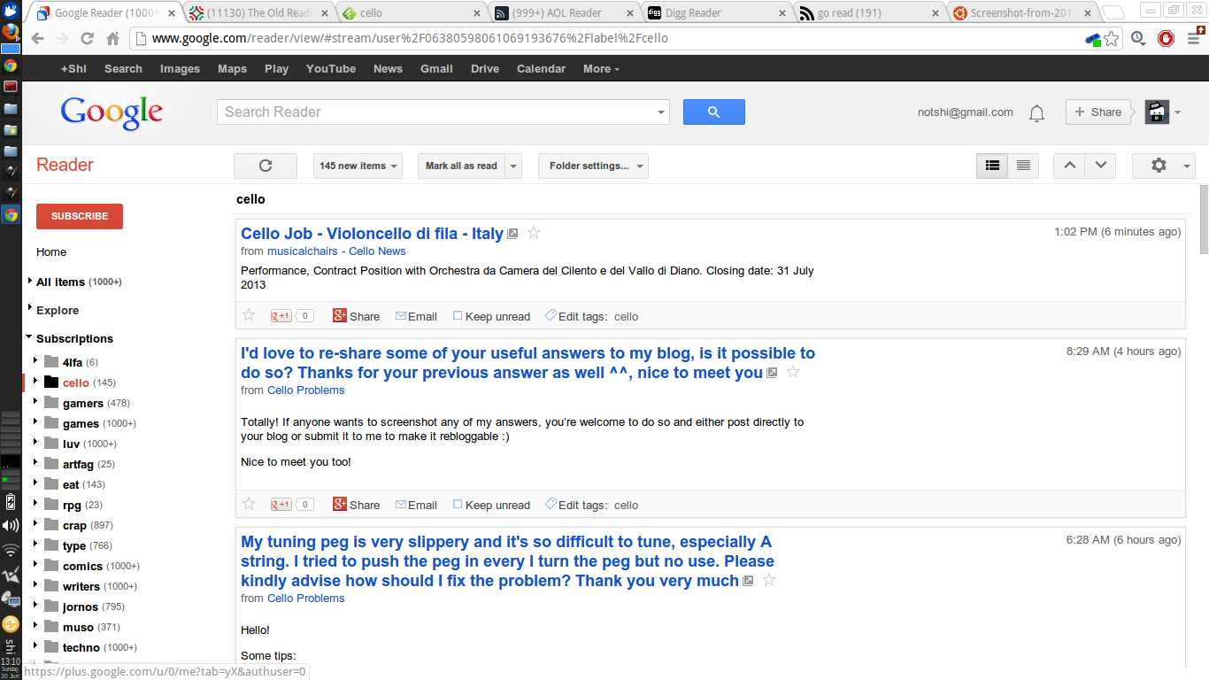
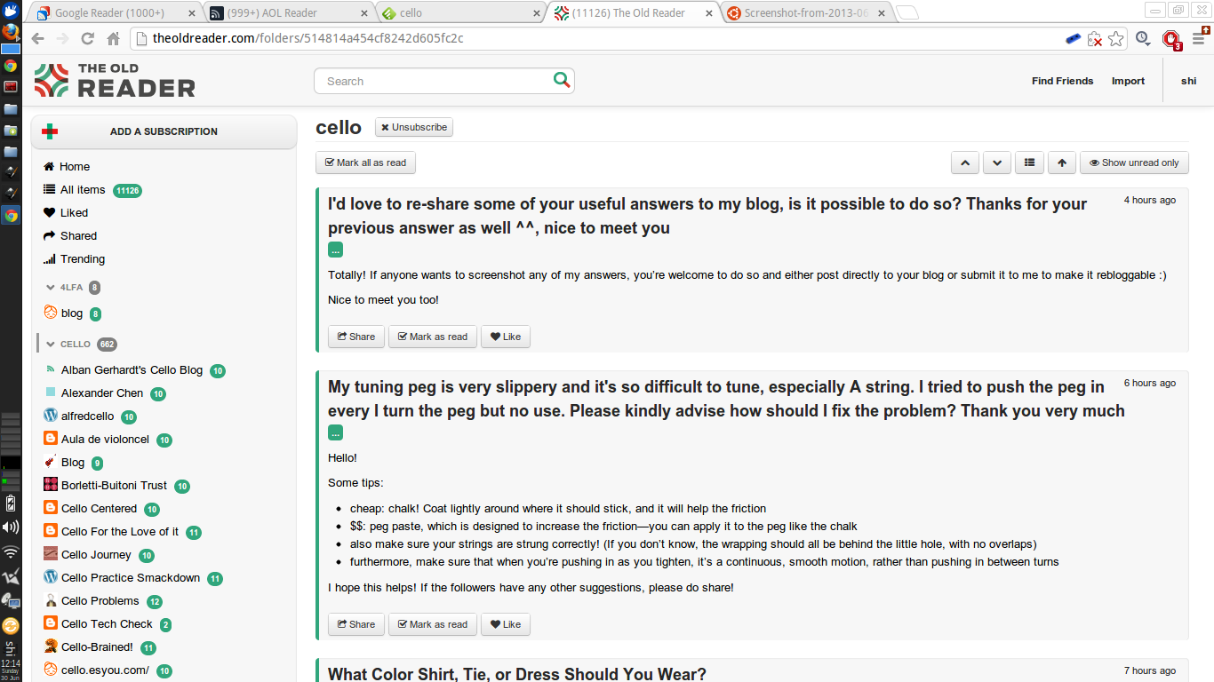
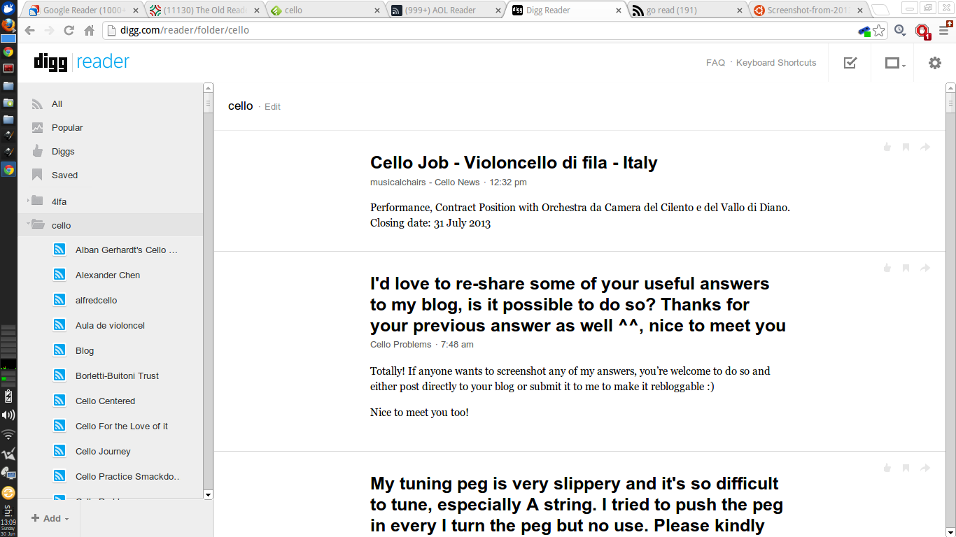
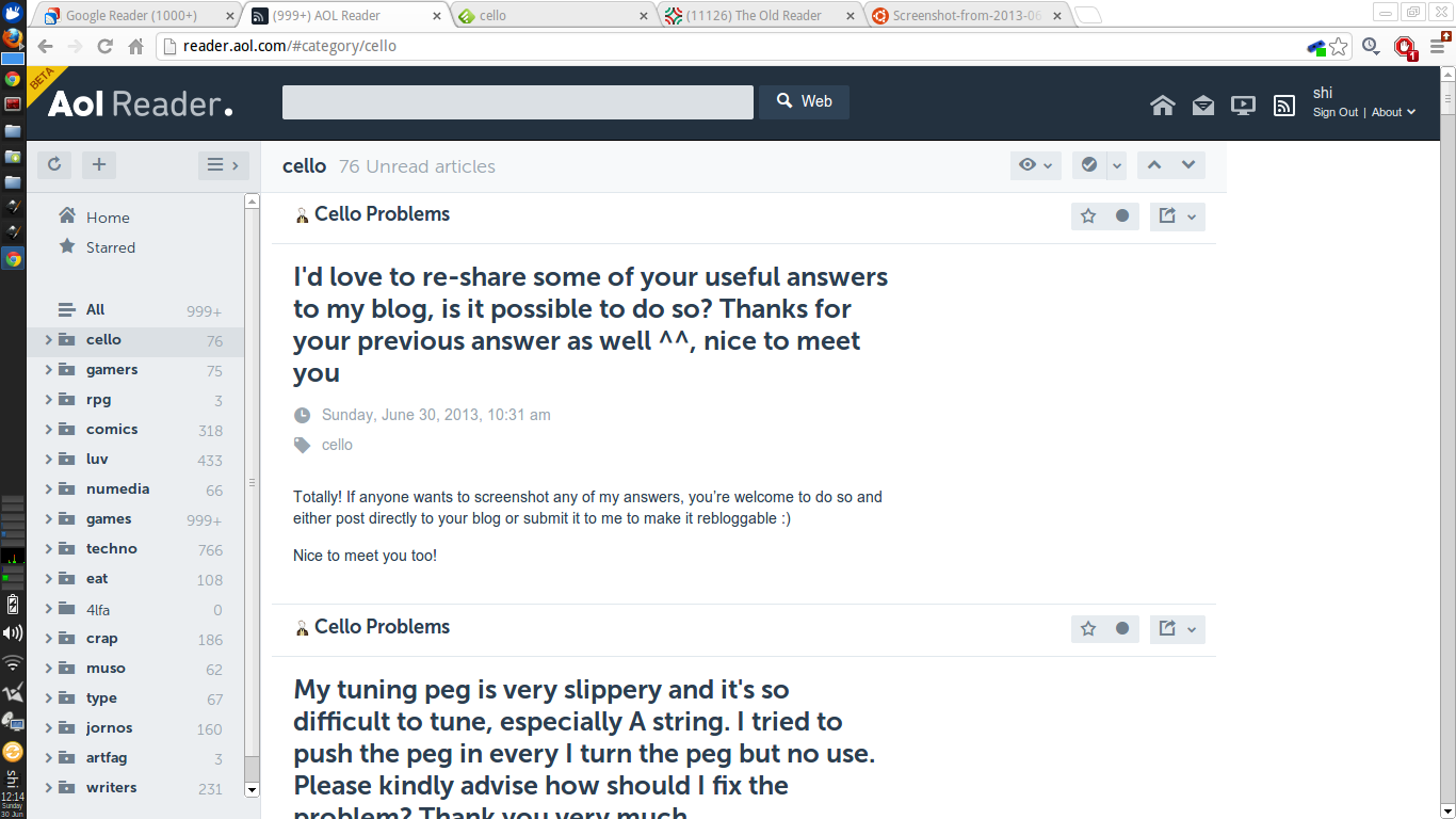
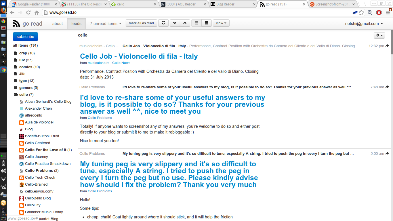
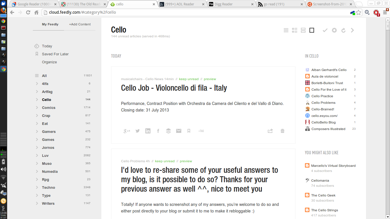
As you can see, there are but negligible differences between them - mostly user interface navigation (all do feature the same left feed list and right reading area), typographical choices, white space and complexity of options and settings available but overall, they are what they are - feed readers. AOL and The Old Reader were a tad slow at updating the feeds but apart from that, they seem to do what they claim to do.
Ease of use, however, differ quite a bit especially when it comes to filtering and organising your feeds into folders and sorting those folders into orders of priorities. By default, only Feedly sorted my folders in alphabetical order whilst the Digg Reader sorted my folders exactly how I sorted them in Google Reader. The other readers, I assume, sorted the folders in order of posts where the folders that included the most recent updates were at the top although when I looked into this further, this might not have been the case. I'm sure you can find out more about their preferred sorting algorithms at their perspective sites.
I did a simple "test" to check the level for ease of use, mainly adding a feed and then putting that feed into a folder which I then unsubscribe and subscribe again.
1. http://theoldreader.com/
This was straightforward - click on the "Add a Subscription" button, plonk in the rss address and tharr she blows. To put that feed into a folder, I merely had to drag and drop into the folder of choice. However, when I tried to unsubscribe from that same particular feed, it just wouldn't let me - no matter how many times I refresh the page, log out of the service and clear cache - clicking on the "Unsubscribe" button did not allow me to unsubscribe. This naturally interrupted the experiment. Also, I had no idea where I was in the hierarchy as there were no breadcrumbs to indicate such a thing nor were there clues or hints until I expanded the folders one by one to find the feed highlighted.
2. http://cloud.feedly.com/
Clicking on the "+Add Content" button switched the feed list into another tab where you could not only add the rss feed you had in mind but also search for topics that might be relevant to your interests instead (typing "webcomic" got me tonnes of awesomeness). Once you type in the rss feed, you had the option to add it to your feed list if the feed showed up in the searches. I thought this was a nice touch as Feedly makes it obvious if you were trying to follow a site that enabled rss feeds or not. At this point, most readers would just include the feed into the reader and then it's up to you to sort it into a folder or associate it with tags and whatever but not Feedly! Straightaway, you are sent to a tab where you could mark the feed as top priority and categorise it into a folder or folders of your choice. Classy. However, once that was done, the feed disappeared from my main page and I had to go through my folders to find it (huzzah for being in alphabetical order!). There are no breadcrumbs here but the right side of the main reading area is now occupied with a column that included a few of the other feeds found under the same category/folder with the category/folder name above it. You could also edit the category right on the same page so that was handy. Upon trying to remove the feed, I was accosted by a rather large notification that warned me of this move and that doing so will remove the feed from both feedly and google reader(?) but at least, removal was a success. Adding it again was a breeze as it was merely a click away from the same page.
3. http://reader.aol.com
Like Feedly, adding a feed to the AOL Reader took me to a search function where I was also able to look up topics but with very different results - a mere 3 results showed up on AOL as opposed to 20 on Feedly. Once I typed in my rss feed, like Feedly, I was also allowed to pick folders and categories or make new ones to associate it with and even rename the source. There are no breadcrumbs but associated categories show up as tags beneath the title of the posts. Again, the current feed was not highlighted on the feed list so I had to find it manually under the category/folder associated with it. This proved tiresome as the names of the feeds were too large to fit within the listings even at the default setting so they were mostly cut off and trailed off into ellipses. Unsubscribing from this feed was not as straightforward as it could be - you had to go into "Organize" mode and then go into the respective folder of that feed (if you remembered!) and then remove it from the list. Upon doing so, AOL Reader confirms my decision with a notification screen but also tells me that any starred items will be kept but not updated. Nice. To re-subscribe, I had to redo the whole process again as if it was a new, unique feed.
4. http://digg.com/reader
Like the previous readers, you are able to search for topics or just add an rss address of your choosing. The search results for, "webcomics" are not as many in variety as Feedly with identical feeds showing up more than once but definitely much more in quantity than AOL. Once I added my feed of choice, it shows up in the feed list straight away which I then dragged and dropped into the folder of my choosing. Again, no breadcrumbs to be found anywhere but the feed highlights itself when clicked on. Unsubscribing was easy via the "Edit" link next to the feed title on the main reading area. However, if you do decide to unsubscribe mid scroll after about say, 50 posts, you will find yourself having to scroll back up to the top to access that link (or just click on the feed from the feed list). Upon doing so, I was faced with a popup that allowed me to either rename the feed or unsubscribe and once I clicked on the latter, a browser window appeared to confirm this decision. Not just any browser window, the serious kind that denies you access to other browser-based activities until you dealt with it first. After doing this, I noticed that even if the feed was removed instantly from the feed list, I was still on the same page as I was earlier as if I had not unsubscribed from the feed and still able to access the "Edit" link to unsubscribe from the unsubscribed feed. Caches, eh. Finally, to re-subscribe, I redid the whole process once again - add, drag, drop.
5. http://www.goread.io/
Clicking on the "Subscribe" button takes me to a whole new page where my only option was to type in the feed url of my choosing. Upon doing so, the site goes into a "loading" stance before taking me back to the page where all my feeds show up in the main reading area. From here, I had to scroll all the way down on the feed list to find the new feed I had just added. Surprisingly, when I clicked on the feed, GoRead tells me there were no unread items found so I had to tell it to show me all items to access the posts. There were no clear ways to categorise the feed nor was there a way for me to sort it into a folder (I tried dragging and dropping to no avail and the settings button at the top right only allowed me to rename or unsubscribe) unless I've totally missed it. Unsubscribing does nothing yet but as this is a new reader (and open source!), I'm sure this is being fixed as I type this. You can read the announcement and more from the developer on http://mattjibson.com/blog/2013/06/26/go-read-open-source-google-reader-clone/ . Warning - this is on app engine and from experience, may not be as "reliable" as it could be.
And so, this concludes my experiment. I have yet to choose a favourite so will come to that soon enough after using them for a longer period. My main problem with most of these readers is that the content seemed secondary compared to the overall branding and design of the reader site itself. Feedly had a horrible font choice (what's with all that white space?!) and only Go Read made sure the content headers stood out but I'm guessing this was mostly due to it being a Google Reader clone instead of an independent design choice.
Fortunately there are plenty of alternatives out there, albeit inferior in many ways, and I have been using one sparingly since the announcement and since then, more have turned up as possible replacements. Migration to the new services was mostly hassle-free; some asked to import your feeds whilst most were as easy as logging into your Google account and allowing the new services permissions before taking you to a page where all the feeds you've been reading appear before you in an instant.
In fact, it has been so easy to migrate that I've been trying out a few. Here are a few screenshots of the readers I've used. For the sake of comparison, I've picked a particular folder to display; the one that I read above all else.


As you can see, there are but negligible differences between them - mostly user interface navigation (all do feature the same left feed list and right reading area), typographical choices, white space and complexity of options and settings available but overall, they are what they are - feed readers. AOL and The Old Reader were a tad slow at updating the feeds but apart from that, they seem to do what they claim to do.
Ease of use, however, differ quite a bit especially when it comes to filtering and organising your feeds into folders and sorting those folders into orders of priorities. By default, only Feedly sorted my folders in alphabetical order whilst the Digg Reader sorted my folders exactly how I sorted them in Google Reader. The other readers, I assume, sorted the folders in order of posts where the folders that included the most recent updates were at the top although when I looked into this further, this might not have been the case. I'm sure you can find out more about their preferred sorting algorithms at their perspective sites.
I did a simple "test" to check the level for ease of use, mainly adding a feed and then putting that feed into a folder which I then unsubscribe and subscribe again.
1. http://theoldreader.com/
This was straightforward - click on the "Add a Subscription" button, plonk in the rss address and tharr she blows. To put that feed into a folder, I merely had to drag and drop into the folder of choice. However, when I tried to unsubscribe from that same particular feed, it just wouldn't let me - no matter how many times I refresh the page, log out of the service and clear cache - clicking on the "Unsubscribe" button did not allow me to unsubscribe. This naturally interrupted the experiment. Also, I had no idea where I was in the hierarchy as there were no breadcrumbs to indicate such a thing nor were there clues or hints until I expanded the folders one by one to find the feed highlighted.
2. http://cloud.feedly.com/
Clicking on the "+Add Content" button switched the feed list into another tab where you could not only add the rss feed you had in mind but also search for topics that might be relevant to your interests instead (typing "webcomic" got me tonnes of awesomeness). Once you type in the rss feed, you had the option to add it to your feed list if the feed showed up in the searches. I thought this was a nice touch as Feedly makes it obvious if you were trying to follow a site that enabled rss feeds or not. At this point, most readers would just include the feed into the reader and then it's up to you to sort it into a folder or associate it with tags and whatever but not Feedly! Straightaway, you are sent to a tab where you could mark the feed as top priority and categorise it into a folder or folders of your choice. Classy. However, once that was done, the feed disappeared from my main page and I had to go through my folders to find it (huzzah for being in alphabetical order!). There are no breadcrumbs here but the right side of the main reading area is now occupied with a column that included a few of the other feeds found under the same category/folder with the category/folder name above it. You could also edit the category right on the same page so that was handy. Upon trying to remove the feed, I was accosted by a rather large notification that warned me of this move and that doing so will remove the feed from both feedly and google reader(?) but at least, removal was a success. Adding it again was a breeze as it was merely a click away from the same page.
3. http://reader.aol.com
Like Feedly, adding a feed to the AOL Reader took me to a search function where I was also able to look up topics but with very different results - a mere 3 results showed up on AOL as opposed to 20 on Feedly. Once I typed in my rss feed, like Feedly, I was also allowed to pick folders and categories or make new ones to associate it with and even rename the source. There are no breadcrumbs but associated categories show up as tags beneath the title of the posts. Again, the current feed was not highlighted on the feed list so I had to find it manually under the category/folder associated with it. This proved tiresome as the names of the feeds were too large to fit within the listings even at the default setting so they were mostly cut off and trailed off into ellipses. Unsubscribing from this feed was not as straightforward as it could be - you had to go into "Organize" mode and then go into the respective folder of that feed (if you remembered!) and then remove it from the list. Upon doing so, AOL Reader confirms my decision with a notification screen but also tells me that any starred items will be kept but not updated. Nice. To re-subscribe, I had to redo the whole process again as if it was a new, unique feed.
4. http://digg.com/reader
Like the previous readers, you are able to search for topics or just add an rss address of your choosing. The search results for, "webcomics" are not as many in variety as Feedly with identical feeds showing up more than once but definitely much more in quantity than AOL. Once I added my feed of choice, it shows up in the feed list straight away which I then dragged and dropped into the folder of my choosing. Again, no breadcrumbs to be found anywhere but the feed highlights itself when clicked on. Unsubscribing was easy via the "Edit" link next to the feed title on the main reading area. However, if you do decide to unsubscribe mid scroll after about say, 50 posts, you will find yourself having to scroll back up to the top to access that link (or just click on the feed from the feed list). Upon doing so, I was faced with a popup that allowed me to either rename the feed or unsubscribe and once I clicked on the latter, a browser window appeared to confirm this decision. Not just any browser window, the serious kind that denies you access to other browser-based activities until you dealt with it first. After doing this, I noticed that even if the feed was removed instantly from the feed list, I was still on the same page as I was earlier as if I had not unsubscribed from the feed and still able to access the "Edit" link to unsubscribe from the unsubscribed feed. Caches, eh. Finally, to re-subscribe, I redid the whole process once again - add, drag, drop.
5. http://www.goread.io/
Clicking on the "Subscribe" button takes me to a whole new page where my only option was to type in the feed url of my choosing. Upon doing so, the site goes into a "loading" stance before taking me back to the page where all my feeds show up in the main reading area. From here, I had to scroll all the way down on the feed list to find the new feed I had just added. Surprisingly, when I clicked on the feed, GoRead tells me there were no unread items found so I had to tell it to show me all items to access the posts. There were no clear ways to categorise the feed nor was there a way for me to sort it into a folder (I tried dragging and dropping to no avail and the settings button at the top right only allowed me to rename or unsubscribe) unless I've totally missed it. Unsubscribing does nothing yet but as this is a new reader (and open source!), I'm sure this is being fixed as I type this. You can read the announcement and more from the developer on http://mattjibson.com/blog/2013/06/26/go-read-open-source-google-reader-clone/ . Warning - this is on app engine and from experience, may not be as "reliable" as it could be.
And so, this concludes my experiment. I have yet to choose a favourite so will come to that soon enough after using them for a longer period. My main problem with most of these readers is that the content seemed secondary compared to the overall branding and design of the reader site itself. Feedly had a horrible font choice (what's with all that white space?!) and only Go Read made sure the content headers stood out but I'm guessing this was mostly due to it being a Google Reader clone instead of an independent design choice.
Click here to login if you wish to comment.
View all posts.
View all posts.
11 years ago shi commented on Dr. Bulbaceous: Puzzle Solver...


