Maps should be easy to understand yet informative at a single glance. The thing about designing games with maps is that they can get terribly complicated and large, attempting to simulate conventional maps you find in the real world. Abstraction seems an obvious choice but unorthodox and not easy to grasp. For this reason, virtual worlds tend to be expansive and lonely.

Fi.1 Here be dragons made of clocks.
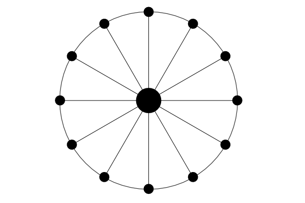
The map we have settled for in the game is designed to resemble the 12 segments of a clock. Traditionally, compasses are a common choice but this feels limited when you need to point to a specific location that resides somewhere near 9 degrees north, relative to where you are. A clock, on the other hand, is a form of measurement that, hopefully, everyone is familiar with. It is precise, flexible and easy to locate; for example, when you need to go to 12:36.
There will be 12 locations, each exactly on the hour sitting on the edge of the map and for each location, there may be branches to other places. The asylum sits in the centre, ala a concentric circle from which madness is most concentrated in the middle of the map.
Oddly enough, despite being rather abstract, visualising an actual town is easier than it is lead to be. This will come in handy when it comes to illustrating the individual card locations in relation to each other, not to mention the actual placement of the player during the game play.
So far, the confirmed locations are as follows (starting clockwise from 12 o'clock):
Town Hall (comprises of Post Office and Bank)
Police Station
Pub (connected to Hotel)
Local Store
Harbour
Cave
Lighthouse
Woods
Big House
Church (includes a Graveyard)
Doctor
Library (connected to a University)
Each of these locations will include 2 inhabitants each known as Character cards and I will be discussing these in my next blog post.
Click here to login if you wish to comment.
View all posts.
View all posts.
11 years ago shi commented on Dr. Bulbaceous: Puzzle Solver...


