


Welp, here's a poster of one of the games we're currently in the process of developing. I'm probably a lot happier with how this ended up looking compared to the one in the previous post. I've always been rather wary of gradients on fonts especially when done cheaply (one layer instead of a hundred) and especially on the medium I'm working in - scalable vector graphics.
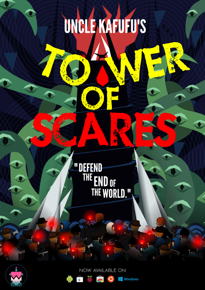
Now that we can afford working longer hours on a particular game, iteration is conceivable. This has definitely increased productivity and motivation as I am now allowed to make changes at my own pace. Suffice to say, my approach on the poster harks back to the time I was in the publishing industry doing graphics for advertising agencies.
Now that we can afford working longer hours on a particular game, iteration is conceivable. This has definitely increased productivity and motivation as I am now allowed to make changes at my own pace. Suffice to say, my approach on the poster harks back to the time I was in the publishing industry doing graphics for advertising agencies.
Click here to login if you wish to comment.
View all posts.
View all posts.
11 years ago shi commented on Dr. Bulbaceous: Puzzle Solver...